ED CUTS, PASTES AND WON IN OUR BOOKS...
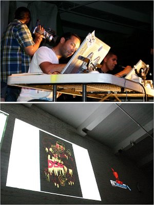
EDWARD UBIERA AKA Mr.CHICKENS AND ROBOTS, was selected to partake in one of NYC's the most unique and dopest graphic design competitions, The Cut and Paste Tournament.
In the Cut and Paste Digital Design tournament, eight graphic designers(of which Ed was one of) display their artistic and technical prowess in front of a screaming audience and panel of distinguished judges.
Mr. Ubiera killed the competiton in round one...equipped with his "ill-matic" imagination, swiftness and a couple of beers, he left them in digital dust...then round two happened... and this is how it all went down according to another spectator, M.TONY:
"there were 4 contestants competing but it was a 2 on 2 competion...the theme was George Bush and you(the contestant) had to make a poster...from the jump it was a clear sign that Ed and the dude he was competing against where the best ones I was standing by the stage so they were two people I was focusing on."
"I really had no interest in the last 2 contestants cause what they were creating looked WACK to me. Ed was rendering a picture of Bush into a vector image and his competion was making Bush look like a bandmember from KISS...after Ed finish his vector image of Bush he took some pictures of some toy soldiers...his competion was almost pretty much finished with his poster which was George Bush face in Gene Simmons from KISS, make up with his tounge sticking out and a title saying "IRAK AND ROLL". I thought it was a great play on words and funny image but the KISS thing has been done so many times Ed on the other hand did something totally original and it looked great...in a short amount of time, Ed took pictures of Bush, Toy Soilders and a Hand, vectorized it and made an awesome looking poster...his poster was George Bush as a puppet master and the soldiers as his puppets and the strings ever read something that I can't remember at the moment."
"His poster read "THE PUPPET MASTER" and he created his own fonts when it came time to judge, I thought Ed was the clear winner...his image was the most creative but he was paired against, I guess the crowd favorite...so they went with his competion...and one of the other 2 wack contestants was chosen. To me, the should've chosen the 2 best designs which where Ed and his compition."
There you have it...GET INVOLVED!
The images below are of Ed's winning round.
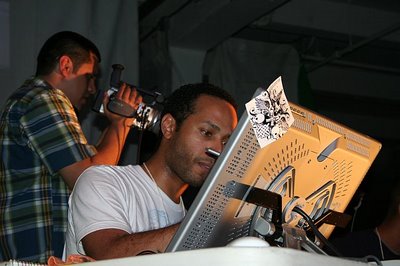
Ed gets busy...I pity his competitors
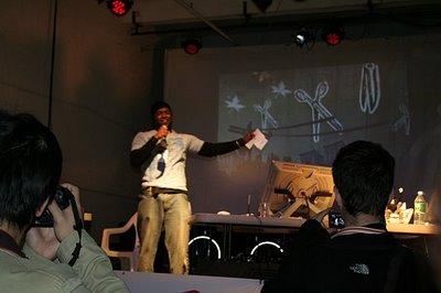
The CUT and PASTE host with the most...energy, keeps the crowd amped!
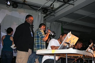
ED gets deeper into his work...
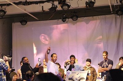
the look of a true champion!
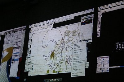
ED's winning work...in progress

0 Comments:
Post a Comment
<< Home